
22: A Stark Difference in Design
22: A Stark Difference in Design
Designing for accessibility isn't difficult, but the convo to get there is
Hey! Welcome to this week’s Stark Difference in Design. Last week’s Edition No. 21 had a 49% open rate. The most popular link was the My Struggle with Color blog post. 💌
Tidbits
+ Designing for accessibility is not that hard
There are over 56 million people in the United States (nearly 1 in 5) and over 1 billion people worldwide who have a disability.
Thanks Pablo Stanley for putting together this simple step guide on designing a more enjoyable experience for a wide range of people, including individuals who have visual, motor, auditory, speech, or cognitive disabilities.
TLDR:
Add enough color contrast
Don’t use color alone to make critical info understandable
Design usable focus states
Use labels or instructions with form fields
Write helpful alt text on images and non-text content
Use correct markup
Support keyboard navigation
Seven easy steps, and some of the most underrated efforts on the design and development side of things.
+ The end of the celebrity designer
"Whether it’s embracing systems and tools that make the design process more collaborative and transparent [...] we should be thinking about what having a “seat at the table” means for those who’ve never even entered the room."
A great write-up from Tim Van Damme on creating a more open approach to designing to level up younger designers while demystifying the process for the rest of the people in the organization.
+ What we’re leaving out of the discussion around inclusive design
Exclusion is not a PR-friendly word, but it is a universal human experience. We all know how it feels when we’re left out. We each experience it over the course of our lives. Exclusion is concrete and specific, and can often be traced back to an identifiable source. This makes it a meaningful starting point for inclusive design. Our ambitions for inclusion are best achieved by first recognizing and then remedying exclusion wherever we encounter it.
and
Without a clear agreement on what inclusion is, can we ever hope to achieve it? How can we design for something that means so many different things to different people?
For bookworms
+ Bad Blood: Secrets and Lies in a Silicon Valley Startup
Bad Blood by John Carreyrou is such a page-turner of lies and deceit, it could be a novel. What’s scary? It’s not. It documents the criminal, fraudulent, and unethical actions of Elizabeth Holmes, Theranos founder and CEO, and her closest allies that refused to stop her.
It’s the perfect how-to guide on what not to do when designing and selling a product.
From the Stark team
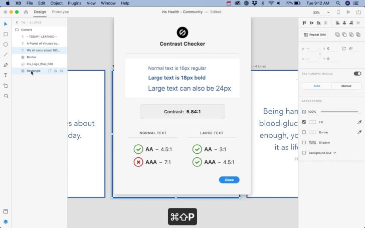
+ Stark has Keyboard shortcuts!
For those of you missing the ability to continually re-check the contrast in Sketch, shortcuts increase your experience for the better when it comes to quickly selecting set after set of layers and checking them.
Total time to check your contrast takes anywhere from 2-4 seconds—from finding and selecting layers, to putting in the shortcut. And colorblind simulation takes about 2 seconds. Holy rapid checking, batman! 😱
+ Stark as the go-to for a11y
It’s great and telling to see this recurring conversation with Stark as the go-to when designing for accessibility. Thanks, Jake!

+ Want to sponsor our newsletter?
We put a lot into our newsletters and have been thinking about different ways to deliver even more quality and resources to you. Part of that is exploring what sponsorships look like and if it’s the right fit. So if you’re (part of) a company, institute or agency interested in sponsoring one of our newsletters, let’s chat!
Ping us via email or simply replying if you’re seeing this in your email :)
Liked this newsletter? Let us know. And we’re always talking shop on Twitter @getstarkco or in our community chat.
–Team Stark